研读雅思范文及作文模板可以帮助检验自己的写作水平,并能很好地吸收和应用优秀范文里的优秀内容。更多内容请关注新东方网。
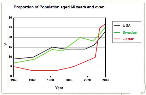
The graph below shows the proportion of the population aged 65 and over between 1940 and 2040 in three different countries.
Summarise the information by selecting and reporting the main features and make comparisons where relevant.
 Sample Answer:
The given line graph compares the aged people of Sweden, the USA and Japan from 1940 and gives projection till 2040.
As is observed from the line graph, initially in 1940, the proportion of aged people who were over 64 years old was between 5 to 10 percent. This rate kept on increasing in the USA and Sweden while decreased in Japan. After 40 years in 1989, this percentage was around 15% both in Sweden and the USA while it was only 2-3% in Japan. The more the aged people in a country the better the life expectancy and medical improvement and this indicated the improvement in the USA and Sweden while down-grade trend in Japan. But after 2000, the rate of aged people in Japan kept increasing sharply and it is projected that in 2040 the number of aged people would surplus the number in Sweden and the USA though these later two countries would also have more aged people in this coming years they they have now. This also forecast the life expectancy and medical advancement in Japan after 2030.
最新热文推荐: 2019,考试分手!——留学考试备考规划